Introduction
Tinder Welcome Screen UI plays a crucial role in user retention and engagement within the competitive world of dating apps. Tinder, a leading platform, has carefully crafted its welcome screen to captivate new users and ensure seamless onboarding. This article delves into the key elements of the Tinder welcome screen UI, examining its design principles, user experience strategies, and the overall impact on user engagement.
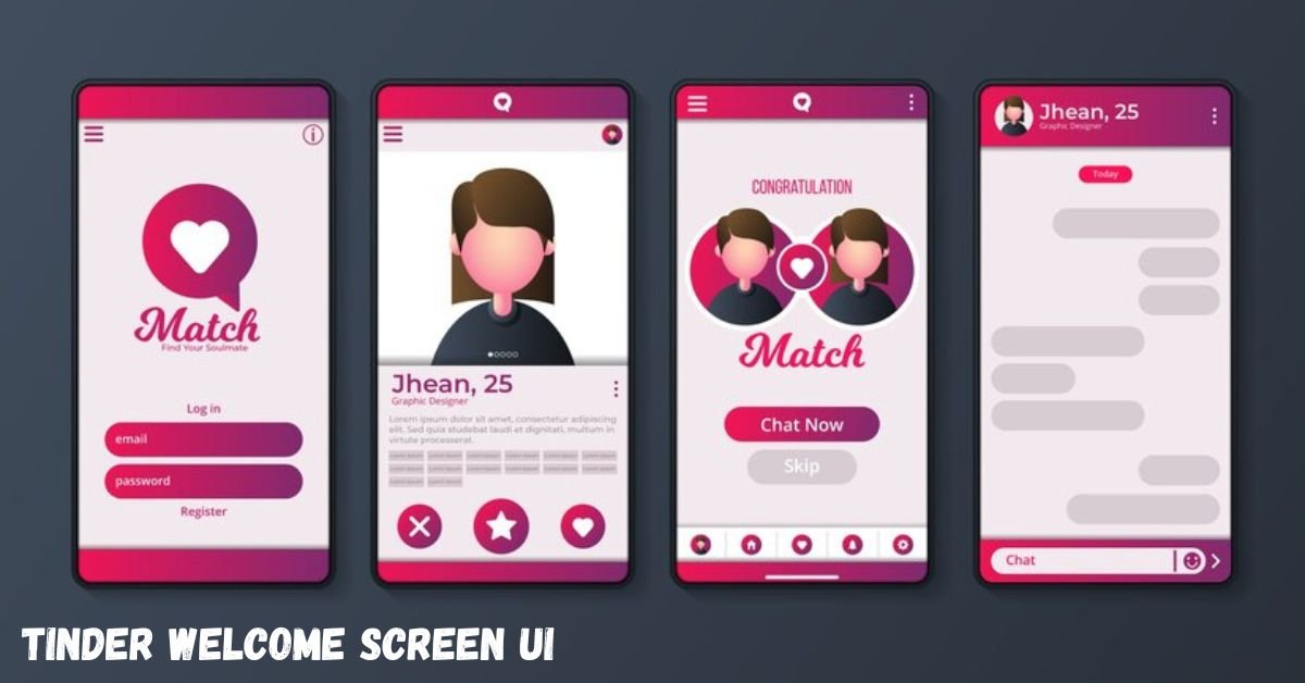
Understanding Tinder’s Welcome Screen UI
The welcome screen serves as the user’s first interaction with the app, setting the tone for their experience. Tinder’s design focuses on simplicity, clarity, and immediate engagement. Upon launching, users see a clean interface with the Tinder logo and a brief tagline that highlights the app’s purpose. This minimalist approach ensures that users are not overwhelmed and can quickly understand the app’s value proposition.
Key Elements of the Welcome Screen
- Branding and Visual Appeal: Tinder employs a consistent color scheme and typography that align with its brand identity. The use of vibrant colors and dynamic visuals captures attention and conveys energy, appealing to the app’s target demographic.
- Clear Call-to-Action (CTA): The welcome screen prominently features a CTA button, such as “Sign Up” or “Log In,” guiding users toward the next step. This direct approach reduces friction and streamlines the onboarding process.
- User-Centric Design: The interface is designed to be intuitive, with easily navigable options. This user-centric approach enhances usability and encourages users to proceed with the registration or login process.
- Social Proof and Trust Signals: Incorporating elements like user testimonials or statistics about the app’s popularity can build trust and encourage new users to join.
Design Principles Behind the Welcome Screen
Tinder’s welcome screen design is grounded in several key principles:
- Simplicity: By minimizing clutter and focusing on essential elements, the design ensures that users can quickly comprehend the app’s purpose and navigate the interface with ease.
- Consistency: Maintaining uniformity in design elements across the welcome screen and the rest of the app creates a cohesive user experience, reinforcing brand identity and user familiarity.
- Responsiveness: The design adapts seamlessly to various screen sizes and orientations, ensuring a consistent experience across different devices.
- Accessibility: Considerations for color contrast, font size, and intuitive navigation ensure that the app is accessible to a diverse user base, including those with disabilities.
Impact on User Engagement
An effective welcome screen can significantly influence user engagement:
- First Impressions Matter: A well-designed welcome screen creates a positive first impression, encouraging users to complete registration.
- Reduced Bounce Rates: By providing a clear and engaging introduction, users are more likely to explore the app further, reducing the chances of them abandoning the app after the first use.
- Enhanced User Retention: A seamless welcome screen boosts user retention by making users feel comfortable and familiar with the app’s interface.
Comparative Analysis: Tinder vs. Competitors
To understand the effectiveness of Tinder’s welcome screen design, it’s beneficial to compare it with other dating apps:
| Feature | Tinder | Bumble | Hinge |
|---|---|---|---|
| Design Aesthetic | Minimalist with vibrant visuals | Clean and modern with a focus on simplicity | Elegant with a focus on user stories |
| Onboarding Process | Quick sign-up with social media integration | Quick sign-up with social media integration | Detailed profile setup with prompts |
| User Engagement | High due to intuitive design and simplicity | High due to user-friendly interface | Moderate; detailed setup may deter some |
| Unique Features | Swipe functionality, quick matches | Women initiate conversations, profile prompts | Prompts for deeper connections |
Best Practices for Designing Effective Welcome Screens
Drawing from Tinder’s approach, here are some best practices for designing an effective welcome screen:
- Prioritize User Experience: Ensure that the design is intuitive and user-friendly, allowing users to navigate seamlessly.
- Incorporate Clear CTAs: Use prominent and concise call-to-action buttons to guide users toward the next steps.
- Maintain Brand Consistency: Align the design elements with the overall brand identity to reinforce recognition and trust.
- Optimize for Performance: Ensure that the welcome screen loads quickly and functions smoothly across all devices.
- Test and Iterate: Regularly test the welcome screen with real users to gather feedback and make necessary improvements.
Conclusion
The welcome screen UI is a critical component of Tinder’s success, playing a significant role in user acquisition and retention. Tinder’s onboarding experience, built on simplicity, consistency, and user engagement, offers valuable insights for designers aiming to create effective, engaging user interfaces in dating apps and beyond.